branding

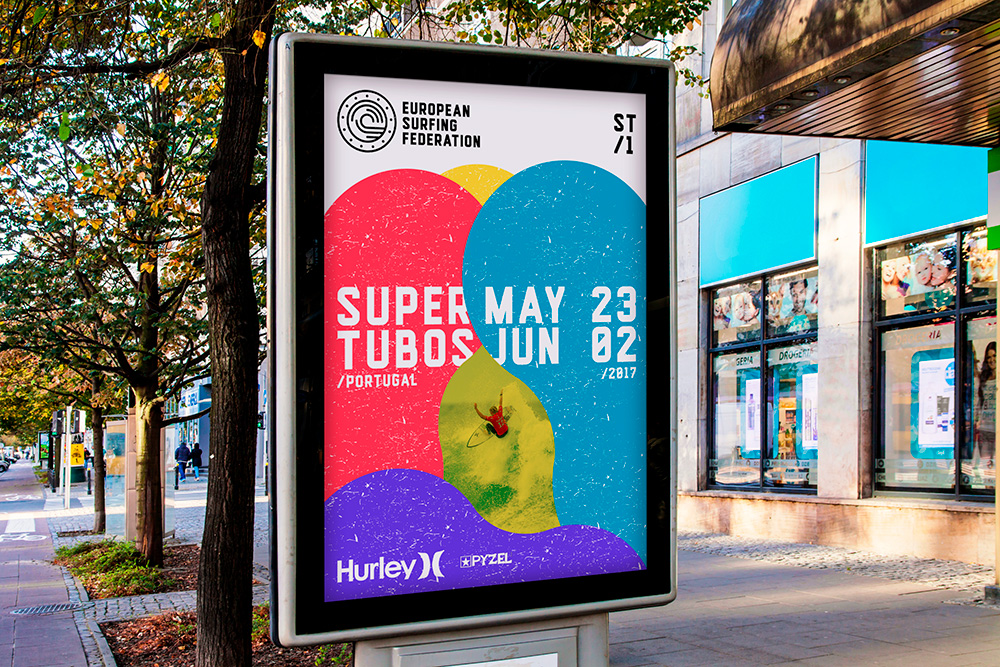
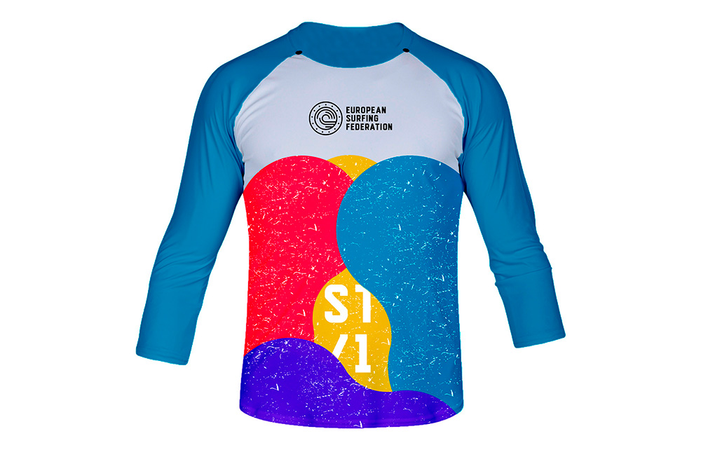
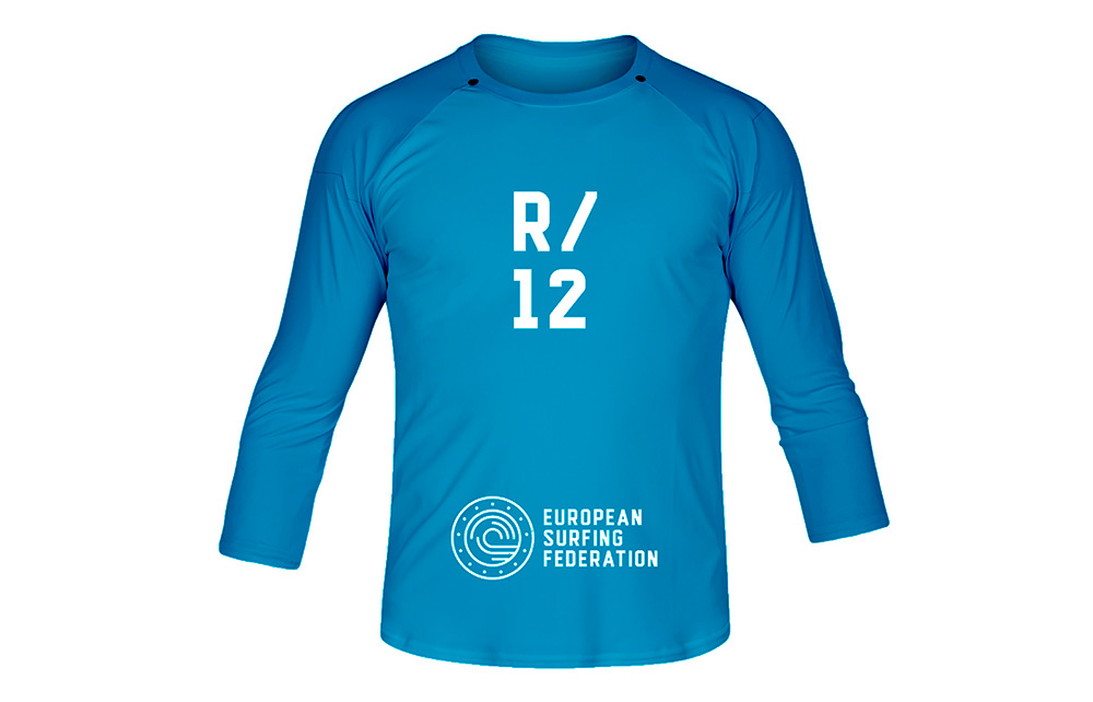
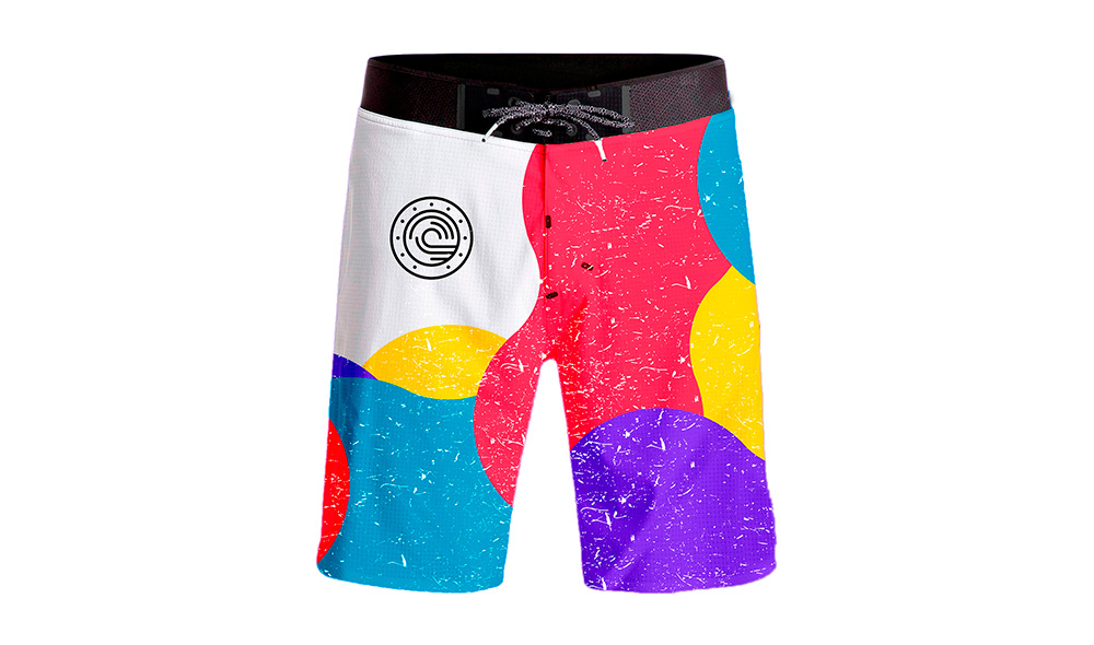
This was made for a school project. For this project we had to rebrand an existing company or organisation and I chose to rebrand the European Surfing Federation.
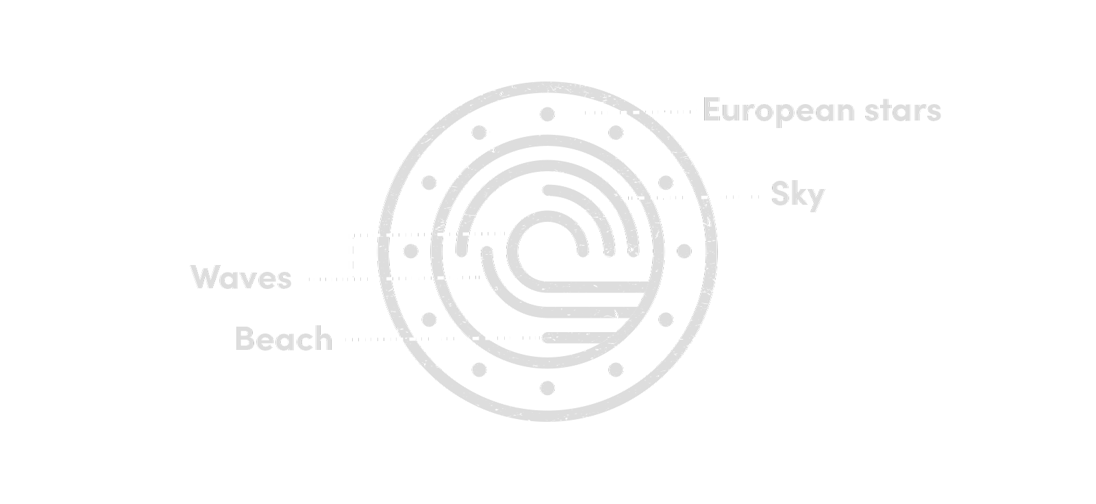
The idea behind the logo was to portrait a wave that was surrounded by the European stars. Eventually I came up with the idea of visualising 3 elements that are important to surfers: the sun, the sea (waves) and the beach.
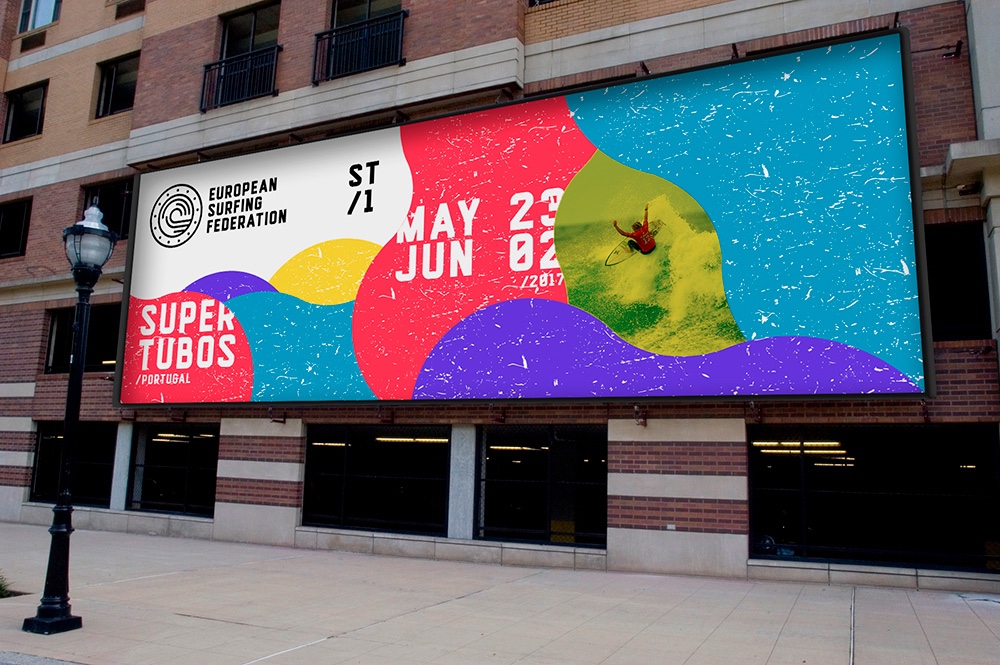
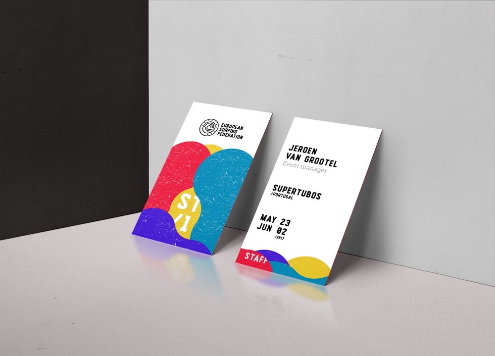
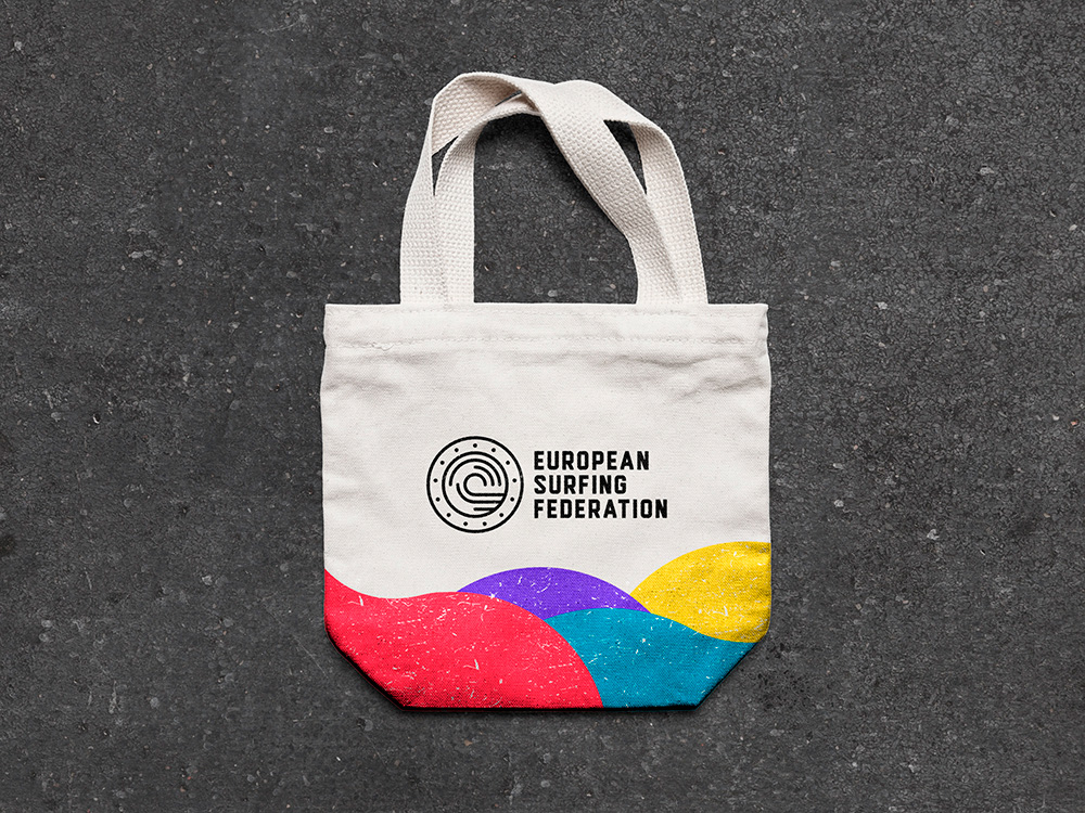
These elements are visualised in the logo through the lines within the circle. But also in the colors red (sunset), blue and purple (water) and yellow (sand). Which are used as extra elements in the branding.